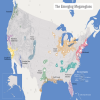
You can fill in the blank with any “western nation” you like. In fact, the nations formerly classified as “western” (America, Europe, Australia, New Zealand or Canada) barely resemble their original founding people. It seems while the descendents of founding settlers of these nations were snoozing someone pulled a fast one and decided having a country with a common heritage (western culture aka western civilization) was a bad thing and needed to be eliminated. Many areas in European nations have what are classified as “no go” areas. What that means is the people who are descendents of the founding settlers are in harms way if they travel into those areas. Obviously the cultural Marxists who laud demographic change claim the people who are being replaced are at fault. Dissimilar cultures do not combine, they clash. That is a historical fact. It makes no difference what century or continent you look at. In Los Angeles, the native Black population is being displaced from their homes by the Latino illegal aliens and legal immigrants mostly from Mexico. Read about it on the Your Black World website here.
Erasing cultural history one alien and legal immigrant at a time. What is the endgame? It’s very simple. Eradication of the founding settlers. In other words eliminating the people of European origin who founded the nations. This is classified as genocide although few people are willing to admit that because they are terrified of being labeled as a racist, hater, xenophobe, bigot, White supremacist, anti-Semite or a Naziwhowantstokillsixmillionjews. I am none of those things however the truth is no defense against the cultural Marxists who seek to marginalize the people they oppose.
If you haven’t figured it out yet, let me share one other little known fact. The GOP and the Democrats are not on your side; they work together against your best interests. They serve their masters, the Rothschild dominated cabal, not you. One thing you need to understand. The Heritage Foundation claims the price tag for amnesty is 6.3 trillion. That is incorrect. What price tag do you place on the irrevocable genocide of Western people and the destruction of Western Civilization?
This is all part of UN Agenda 21. There are no Western Nations in the NWO, just slave nations.
***** I believe a more accurate count of the # of illegal aliens here now is about 35-40 million**********
Question: Who were the more than 90 million people added to the United States since 1970?
Most were immigrants.
Above-replacement-level immigration has doubled U.S. population growth.
There were 203 million people living in the U.S. in 1970 — we’ll call them “1970-stock Americans.” Births to that population have exceeded their deaths, resulting in the growth illustrated in the green block.
The green shows how much growth the U.S. would have had since 1970 if the number of immigrants arriving each year was the same as the number of Americans permanently moving away (currently that is an estimated 225,000). That is known as “replacement-level immigration.”
The red block shows the population growth cause by immigration policies of the U.S. government. It accounts for more than half of population growth since 1970. Although its frontiers were declared closed a century ago, the United States today is adding population at a numerical level just under the phenomenal Baby Boom, which far exceeded all other periods of U.S. population growth.
Why is their natural population growth (as shown by the green area), even though birth rates have fallen below replacement levels?
Well, it takes decades for a country’s population to stabilize after women adopt a family size that is on average 2.1 children. Their children have to finish having their children. Those children have to have their babies and the original mothers have to die off before full stabilization occurs.
A country that wants to stabilize its population has to start around 70 years in advance if fertility drops only to the 2.1 replacement level. Americans have had fertility since 1972 that is somewhat below replacement level. So stabilization could occur a bit sooner.
But even during the 70-year wait for stabilization, a country is able to enjoy substantially reduced population growth. That means the country can enjoy the resulting lowered demands for expanded infrastructure and mass urban development of farmland and natural habitat.
Americans, however, can enjoy none of that, thanks to Congress and its incredible increase in immigration.
If the chart had been started at any other date in U.S. history, wouldn’t it have looked very similar?
No. The last quarter century has been a unique period in U.S. demographic history.
Any other quarter-century slice would show the green –not the red– as the majority of population growth. And not other period except for the Baby Boom (1946-64) would show anywhere close to this much total growth.
At no other time in this country, have recent immigrants and their children (the red block) dominated population growth.
That has many political and sociological ramifications. It means that for the first time in U.S. history when Americans are asked to raise taxes or pay higher prices to provide additional schools, roads, cleaner air, etc., they are asked to do so not for the additional population and conditions they are creating but for the sake primarily of foreign-born residents and their children.
The majority of all new additional infrastructure needs over the past quarter century are the result of Washington’s immigration policies.
Thus, the costs Americans are asked to cover are ones that Congress (through immigration policies), and not American families (through their fertility), have created.
What is meant by “Total U.S. population”?
The circled numbers represent the U.S. Population in millions. The top line of the chart represents the total population of the United States each year.
In 1970, the U.S. population was about 203 million.
Today it has surpassed 293 million.
These numbers come from the U.S. Bureau of the Census which counted the residents of the country in 1970, 1980, 1990, 2000 and a revised projection done by the Census in 2002. All other years are estimated by the Census Bureau based on what was learned in the previous Census, on targeted surveys done each year and on other projection devices.
Does the red block include illegal aliens?
No.
The bar graph counts only the annual number of legal immigrants.
If illegal aliens could be accurately counted and included, it is likely that the 1966-89 period would be revealed as being even more disparate from earlier eras. Illegal immigration is believed to be far higher during recent decades than in the past.
The Census Bureau estimates there are 8 million illegal immigrants currently in the U.S.
On annual illegal immigration, the Center for Immigration Studies has extrapolated the latest Census data to show that 700,000 to 800,000 new illegal aliens are settling each year. Now, far, far more than that enter illegally each year, but there is a lot of back and forth. The 700,000 to 800,000 represents illegals who truly settle in for at least a couple of years, and usually much, much longer. .
Why do these charts start at the 203-million level?
These charts are about growth.
They are not about the total U.S. population — except tangentially — but about any additional growth in that population.
Astute chart readers are conditioned to raise questions when they see charts that start somewhere other than at zero. By picking a starting point proportionately far above zero, a chartmaker may be able to distort the impression of the information being portrayed.
But that is not what is happening here.
Because these charts are about population growth — and because there were 203 million people in this country in 1970 — they reveal only the U.S. population above 203 million.
While the 203 million people who are not shown here play a role in plans for roads, schools, parks, sewers and other infrastructure, it is the addition of residents that creates the greatest challenges.
These charts focus on the millions of people who are being added to the roads, schools, parks, and laborforce.
This information comes from the U.S. Bureau of the Census.
To find similar population growth in foreign countries, we must look to the Third World.
Although its frontiers were declared closed a century ago, the United States today is adding population at a numerical level just under the phenomenal Baby Boom, which far exceeded all other periods of U.S. population growth.
Why do these charts start at 1970?
The era since 1970 has been a unique period of American history. It is the only time that the federal government and the American people have moved in opposite directions in creating the country’s demographic future: The American people have chosen family sizes that allow for a stablized U.S. population; the federal government has chosen policies to force never-ending U.S. population growth.
The year 1970 is around the time of several great changes in America:
1. It was around 1970 — the year of the first Earth Day — when the American people made a collective commitment to stop squandering their environmental resources and to restore the natural world within their nation’s borders to a healthy and sustainable quality. Major laws were passed and agencies established to see that the environmental goals were met. The American people and U.S. companies spent billions of dollars to meet the goals.
2. It was around 1970 that most environmental experts began to agree that it would be difficult for the nation to reach its environmental goals without stabilizing its population at a level not too much higher than the 203 million with which the country began the decade.
3. Although no official population goal was set, a bi-partisan presidential-congressional commission recommended moving toward a stable population to meet environmental, economic and social goals that had been adopted during the Johnson and Nixon administrations.
4. In 1972, the American people — fresh from a historic Baby Boom — lowered their fertility to “replacement level.” Ever since, American fertility has been low enough to allow the population size eventually to stabilize.
5. It was around 1970 that the number of legal immigrants allowed into the country began to rise rapidly as a result of a change in the law back in 1965.
Since 1970, there have been two contradictory blueprints for the nation’s population future:
THE PEOPLE’S BLUEPRINT: The American people since just after 1970 have adopted behaviors and attitudes that — on their own — would move the nation toward a stabilized population size. Through millions of individual and highly personal choices, Americans have adopted on average a family size of two or fewer children while telling pollsters they want a stabilized national population.
WASHINGTON’S BLUEPRINT Since just before 1970, each Congress and each President has adopted a policy allowing immigration far in excess of traditional levels and moving the nation toward constant population increases.
The charts on these pages show how these conflicting visions have affected the demographic direction of the United States. As a Census year, 1970 offers the most logical starting point for measurement.
By starting the charts at 1970, we measure what has happened since around the beginning of the era in which the majority of individual Americans in one way or another embraced population stabilization as a goal.